Use of Color
Main considerations
There are two main concepts you need to consider when it comes to use ofcolor: sufficient contrast and conveying information.
- “Contrast” refers to visual difference between colors; how easy colors are to tell apart from one another. Black and white are the colors with the highest possible contrast with each other. Text with low contrast against the background can be very difficult to read, and adjacent visual elements with low contrast between them can be difficult to distinguish. This may impact users' ability to understand the information conveyed by the graphic.
- You should never rely on color alone to convey the meaning of content. Users who are blind, low-vision, or colorblind will not be able to differentiate between the content you are trying to emphasize if you are relying on color alone to convey information. Screen readers do not “see” or convey color information to users.
Examples
Text contrast
In this example we have the same sentence presented with three different text colors.
The color contrast ratio of the font color to the background color is listed after each. To meet accessibility standards we want regular sized text to have a contrast ratio of at least 4.5:1.
The first example does not have enough contrast to meet accessibility requirements and would be very hard for most to read, the second example does not have enough contrast but is closer to the accessibility standard and may appear readable to many tho it is still short of accessibility standards. The third example does meet all contrast requirements to be accessible and has much more contrast than the second example.
Dakota State University is an accessible place to learn and work. Ratio: 1.4:1
Dakota State University is an accessible place to learn and work. Ratio: 2.5:1
Dakota State University is an accessible place to learn and work. Ratio 12.9: 1
Use of color alone
Below are examples of why use of color alone to convey information can be a major barrier in accessibility for users with low vision or different forms of colorblindness.
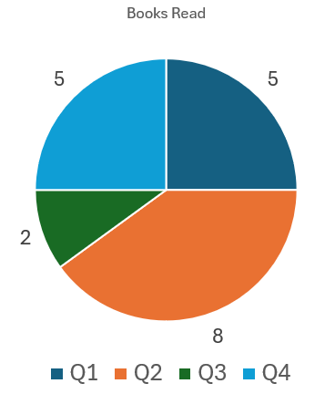
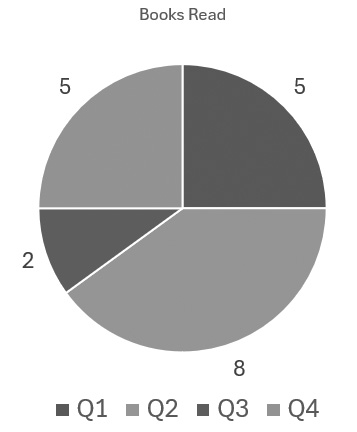
Here we have a chart shown in color and in grayscale to simulate how a user with colorblindness might perceive it. Notice how the information in the chart cannot be interpreted in the grayscale version.
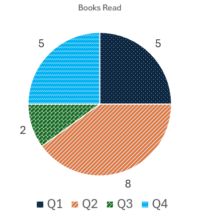
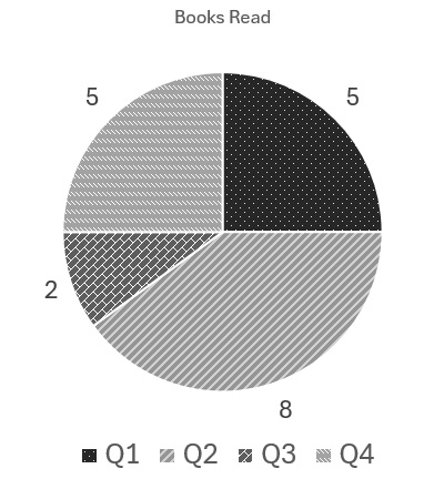
To fix this issue, adding paterns to the chart makes it so we're not relying on color alone to convey information.