
Templates
If these certificates do not fit your needs or you would like help with merging information, please email your request to marketing@dsu.edu.

When creating signatures for a DSU email account, the Board of Regents has established the following guidelines in Policy 1.7.6 Communications and Branding. This aims to ensure uniform standards for visual and written communications across all regental universities.
To help make this process simple for faculty and staff, Dakota State University uses an email signature generator. Do not create your own email signature or use any third-party software to generate an email signature graphic.
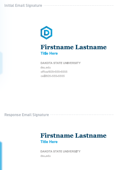
Two signature variants are available to all DSU faculty and staff: the Main Email Signature and the Response Email Signature.
The main signature allows the sender to sign their preliminary correspondence with the DSU main logo, name, official title, department, office phone, and cell phone.
The response signature features a simplified design and is used for subsequent messages in an email chain. It includes name, title, department, office, and cell phone numbers. This option keeps the most relevant contact information while preventing your email thread from including unnecessary signature elements.
For either option: inclusion of additional information, graphics or links not specifically listed below is prohibited. That means employees may not include preferred pronouns, inspirational sayings, links to non-official institutional websites, etc., which do not apply to their professional communications as a representative of the university. Contact information in other channels for official university communication, such as and including Zoom, should follow the restrictions of this policy.
The following information items may be added to the initial/main signature by the user:
- Credentials or degrees earned
- Name of unit (if applicable)
- Email address
- Email address for your unit (if applicable)
- Physical address
- Mailing address
- Telephone number
- Weblinks to official institutional websites or social media platforms (if applicable)
- Institutional motto
- Professional disclosures relevant to advising a communications recipient about disclosure requirements or recognized legal privileges associated with the communication, provided such disclosures are within the scope of your employment.
When creating your DSU presentations, only use official DSU PowerPoint templates.
The master template (DSU branded) is provided on this page, however college-branded formats are available upon request.
Powerpoint Accessibility Tip Sheet
- Use simple themes, pre-defined slide layout templates.
- Slide titles are meaningful and unique. If same topic, add i.e. 1 of 3, 2 of 3, 3 of 3.
- Use default bulleted and numbered lists.
- Avoid text boxes (inaccessible) which do not show up in Outline View.
- Sans-Serif font (Arial, Calibri, Verdana, etc.)
- The main template uses the fonts Roboto and Crimson Pro. These are the preferred fonts to use, as they match DSU brand guidelines.
- Maximum 6-8 lines of text per slide.
- Minimum font size 24 points or above.
- Avoid transitions and animations
- Use alternative text (alt text), a written description of images and/or objects.
- Be brief and descriptive.
- “Image of…”or “photo of…” or “graphic of” is not needed.
- The best method to practice is using captions, this will provide equal access to all users.
- Select colors with deep contrast.
- Provide captions if using color to convey meaning i.e. which section is highlighted in red?
- Links should be clear and directly relate to the title or heading of the linked page.
- Use “Visit the Universal Design Center” instead of “Click here for more details.”
- Do not use the same link text to refer to different resources.
- Do not use different link text to refer to the same resources.
- Use tables to organize data not format information.
- In Table Tools, make sure the Header Row checkbox is checked.
- Include table alt text, captions or brief description.
- Avoid merged, split, or blank cells.
- Ensure video files have captions.
- Ensure audio files have transcripts.
- Use pattern fill or dotted lines texture instead of solid fill or line with labels for each.
- Provide a text summary and a properly coded data table near the chart.
- Avoid color-coding which may not be distinguishable for colorblind users.
- Reading order is shown in reverse, bottom to top in the Selection pane.
- To check or fix reading order, select Home > Arrange > Selection Pane.
- Use Outline View for a quick check of text accessibility. Ensure title and body text are identified correctly in each slide.
- Use the built-in Accessibility Checker in PowerPoint.
- The checker will scan for errors and provide tips on how to fix them.
Download PowerPoint template (Master)