
Brand Manual
The University Toolbox and Brand Manual has been developed by the Marketing and Communication team in conjunction with a Steering Committee. As an ever-evolving document, it is the single reference for all aspects of the University brand. The most updated version of the Toolbox & Brand Manual, applications, electronic files of official logos and icons, social media policies and standards, and marketing/communication support services are available on this website.
Dakota State University Redefined
The strongest component of our University's brand is the logo. This single element represents how we are perceived in our state, across the nation, and around the world. The Dakota State University logo is the most vital and visible component of our brand. It is imperative the main logo, and every logo in the DSU family, is used with consistency and care
Primary university mark
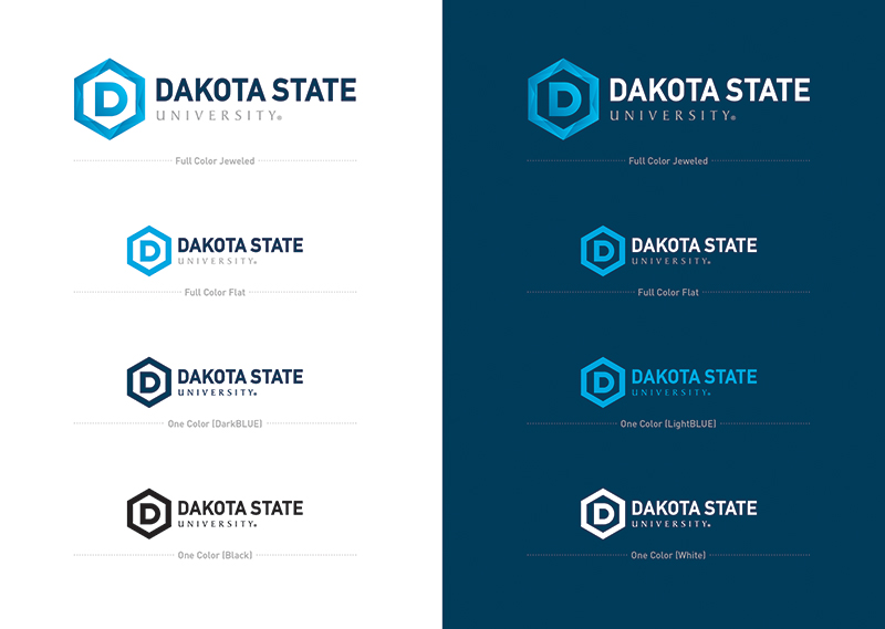
Our primary university mark consists of the hexagonal D icon paired in a horizontal lockup with a variation of the university wordmark. When possible, it is preferred to use the jeweled version of this logo. For times when the jeweled version is not applicable (i.e. screen printing or layered vinyl graphics), the full color flattened version is recommended.
These examples showcase the proper color usage when placing our primary university mark in one color on both light and dark backgrounds.
- The LightBLUE single color is the only variation that can sit on both a light and dark colored background
- The typeface for all modifiers across the university marks is Baker Signet. This typeface was selected for its clear readability at smaller sizes, while maintaining a prestigious academic feel
Alternative university marks
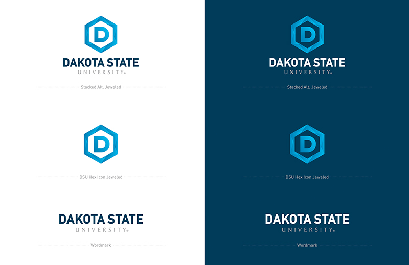
The alternative DSU logo set consists of a stacked version with all elements, and the elements themselves separated out by icon and wordmark.
These marks can be used in the same color sets as the primary university mark: jeweled, flat, and individual primary and neutral colors.
Do not crop the wordmark from the primary university mark. When standing on its own, the wordmark should consist of UNIVERSITY centered below the words DAKOTA STATE.
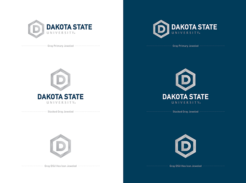
A secondary logo set incorporates a gray palette to mimic a metallic look and feel. These variations should be considered for an alternative apparel option and inspiration for interior design.
Specifications
Clear Space

When using our primary university mark, be sure to provide clear space to ensure uninterrupted readability. The recommended amount of clear space would be equal to the width of the letter E in STATE.
Sizing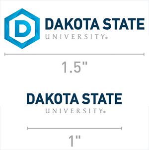
To ensure legibility of all elements, the primary university mark should never be reproduced at sizes smaller than an inch and a half (1.5) wide.
For instances where a size smaller than an inch and a half is necessary, please note the wordmark may be used at a size down to an inch.
Backgrounds

In particular instances, the DSU logo may be placed on full-bleed imagery. Position the logo over solid contrasting areas within the image. Use photography that does not compete with the legibility of the logo.
Do not place any logo over an image, texture, or pattern that diminishes the prominence or legibility of the logo.
Logo Misuse
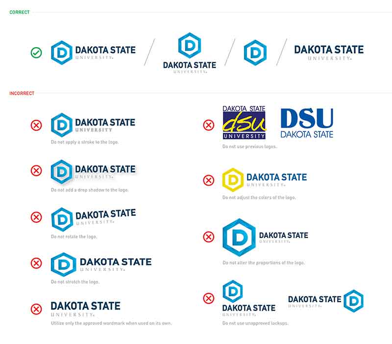
Proper use of the DSU logo will ensure a strong, successful brand. Please refrain from using old and non-approved logos.
Be selective about where and when the logo is used against imagery or photography. If you’re unsure about using the logo over a photo, please contact the DSU Marketing and Communications Department.
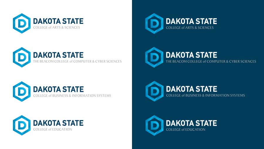
College marks
To maintain consistency across our entire university, our individual college logos will follow a similar structure to the primary university mark with the exception of the modifier which will reflect the college itself. These modifiers will match the same size, color, and typeface as UNIVERSITY in the primary university mark. These marks can be used in the same color sets as the primary university mark: jeweled, flat, and individual single colors.
- These logos should not be used in conjunction with the primary university mark as they are similar in design and would create redundancy between the two with duplication of icon and DAKOTA STATE
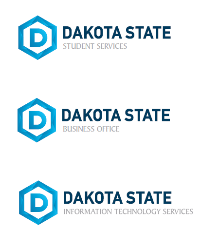
Department marks
As with our college marks, the department marks will reflect the primary university mark, with an updated modifier. These marks are not to be used with the primary university mark, as doing so would yield a duplication of the icon and DAKOTA STATE.
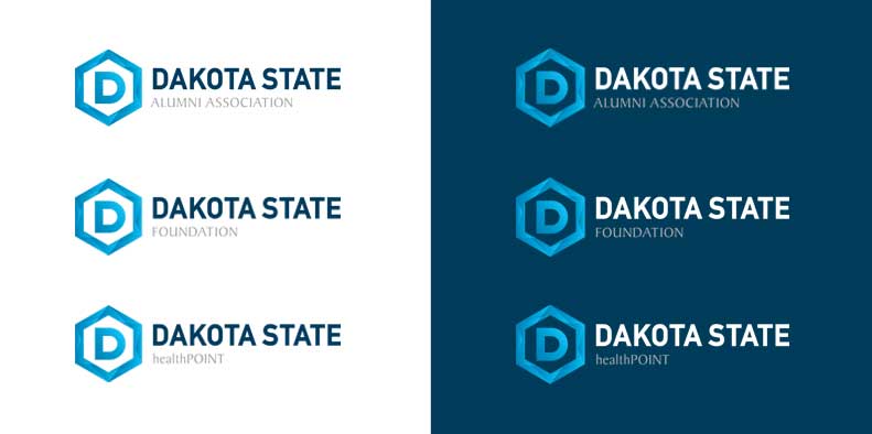
Affiliated marks
Similar to our department and college marks, the Alumni Association and Foundation marks use the equity of the primary university mark with an updated modifier.
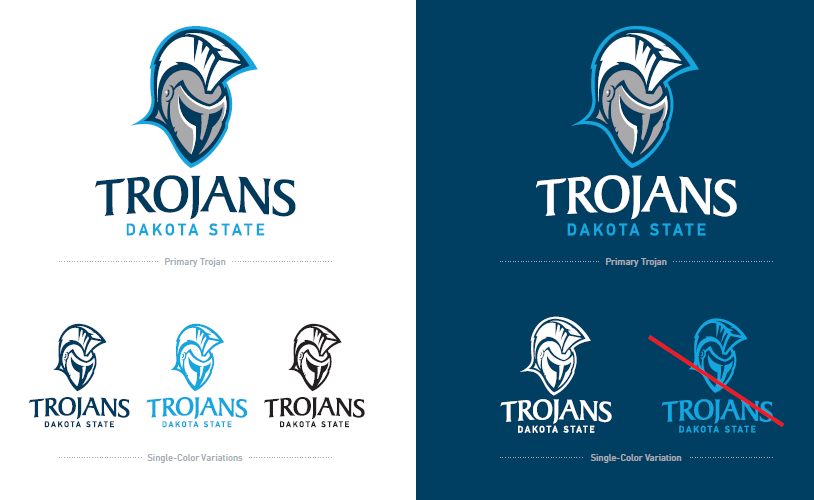
Primary Trojan mark
Our primary Trojan mark features a Trojan in full helmet, stylized at a three-quarters angle. The wordmark consists of the word TROJANS in a curved serif typeface with DAKOTA STATE in a straight sans-serif below. Both elements (Trojan mark and wordmark) can be used on individually and separated if necessary. When used together, the proportions should not be altered.
For dark backgrounds, the only single-color option is white. Do not place the LightBLUE single color option on a dark background. As you can see in the example, it appears as a photo negative when used in this manner. A rule of thumb would be to ensure the eyes of the helmet are the darkest part of the Trojan mark.
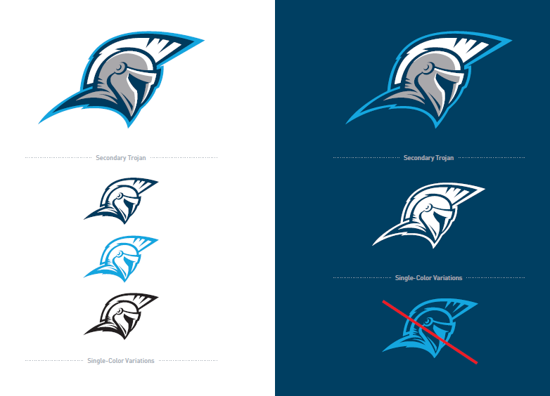
Secondary Trojan mark
Our secondary Trojan mark features a profile view of a charging Trojan. This logo should be used sparingly as to not overpower the primary Trojan mark. Examples of use for this mark would be situations when a more horizontal application would fit best (i.e. football helmet, signage, or vehicles).
As with the primary Trojan mark, the only approved single color variation for dark backgrounds is WHITE.
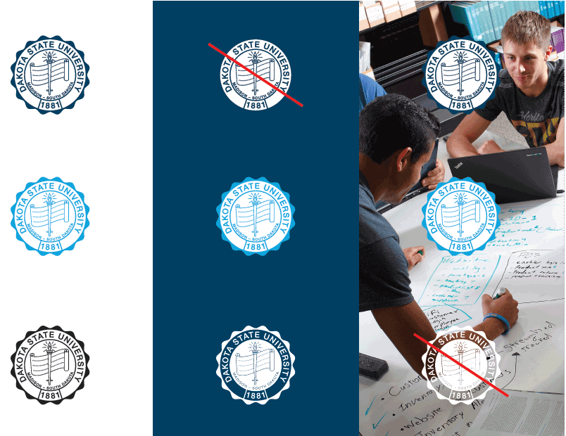
University seal
The Dakota State University seal is used for multiple applications, but its main purpose is to represent more official and formal communications, such as presidential correspondence and messages generated by the DSU Foundation. Using the seal is the fastest way to communicate the prestige of our university. However, the seal should only be used when appropriate.
The following examples show proper and improper use and application of the DSU seal. If you have questions about how and when to use the seal, please contact the DSU Department of Marketing and Communications.
Dakota State University has a distinct palette of colors for use across all mediums. The colors are grouped in categories by primary and neutrals.
These colors play a huge role in defining who we are as an institution. Our modern palette helps us stand out and gives us an identity to our entire organization. To ensure a cohesive and unified brand, these colors should be used consistently.

Primary colors
DarkBLUE is our first primary color. It is best used as the point of emphasis for backgrounds or as the color of headline typography.
DarkBLUE // DSU Blue
- Pantone: 302 C
- CMYK: 100 / 43 / 12 / 56
- RGB: 0 / 65 / 101
- HEX: #004165
LightBLUE or Trojan Blue is our second primary color. It is best used for accenting and works very well for subheads.
LightBLUE // Trojan Blue
- Pantone: 2995 C
- CMYK: 87 / 1 / 0 / 0
- RGB: 0 / 169 / 224
- HEX: #00A9E0
Neutral colors
LightGRAY and DarkGRAY are our neutral colors. These are best served as colors for typography or subtle accents when used in conjunction with our primary and accent colors.
LightGRAY
- Pantone: Cool Gray 6
- CMYK: 18 / 11 / 8 / 23
- RGB: 173 / 175 / 175
- HEX: #F4F4F4
DarkGRAY
- Pantone: Cool Gray 11
- CMYK: 48 / 36 / 24 / 66
- RGB: 77 / 79 / 83
- HEX: #4d4f53
Typography
Dakota State University utilizes a variety of typefaces. The approved fonts are broken into categories, so you can choose the appropriate typeface based on medium.
Print Typefaces
- FF DIN Pro Medium
- ARNO PRO Bold Display
- ARNO Pro Display
- Arno PRO Italic Display
Web Backup Typefaces
- ROBOTO
- CRIMSON Text Bold 700
- CRIMSON Text Regular 400
- CRIMSON Text Regular 400 Italic
Graphic Elements
Hexagons
Dakota State University’s brand utilizes several visual elements to help tell our story. This includes the hexagon—or as we call it, the honeycomb.
The geometry of the honeycomb is fascinating and analogous to our university as a whole. It represents an efficient shape whose construction allows for perfect load distribution that also represents balance and union.
To us, the honeycomb is representative of the strong building blocks our university has used to create the DSU we know today.
Upon request, the DSU Marketing & Communications Department can provide pre-designed hexagon graphics in .PNG or .AI formats with transparent backgrounds for simple application in different marketing and promotional materials.
